You did not create your website just for show. You needed it to create awareness, generate leads, convert sales and much more. Perhaps, yours is the opposite – it is not improving your business. Never mind! We want to help you get your website running and having great impact on your business. Here are 10 tips you don’t want to ignore.
1. Make Your Site Mobile Responsive.
More than 62 percent of shoppers make purchases using their cell phones, and over 90 percent of shoppers use their smartphones even while in retail stores for comparing prices and looking at reviews.

2. Make it easy to find.
You need to have a domain name that describes your business or is your company name. You can even have multiple domains that point to the website.

3. Place your contact information above the fold.
If your business depends on people being able to contact or call your sales team, put that information where they can find it easily (top or bottom).

4. Make it easy to navigate.
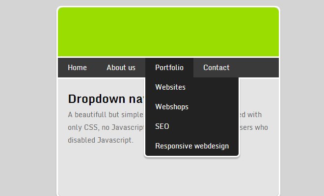
Limit your top-level navigation menu to 5 clearly labelled tabs with related pages organized under them. Have a clear way to get back to the homepage no matter where your readers land.

5. Keep your pages uncluttered.
If a site has too much information, it overloads the mind,making visitors unable to retain the new information. Be sure you use a balance of text & graphics that present a clean page.

6. Make Sure It’s Accurate.
Inaccurate information will turn off consumers, whether it’s a wrong number, outdated product info or simple grammatical errors. Proofread each page before it goes live, periodically check each page.

7. Respect the need for speed.
Survey says 88% said they have a negative association with brands that have buggy websites and apps, 83% said slow websites cause them to have a negative reaction to a brand or company.

8. Have A Call To Action.
Each page on your website should entice the reader to do something – call, sign up, buy or download. Keep it above the fold if possible so they do not have to scroll before finding the call to action.

9. Keep Your Design Simple.
Limit the use of fonts,colors & animated GIFs. It can distract & pull the eyes away from the focus of the webpage. Short paragraphs & bullet points make the info more scannable and likely to be read.

10. Get Personal.
A lot of customers want to know that there’s a real person who’s going to be working with them.Your About page should not be a dry block of text about your company. Include a good photo of yourself or your team.

 12593total visits,6visits today
